Data Visualization + Infographic Design
Data-driven graphics designed to reveal insights and make complex information easier to understand.
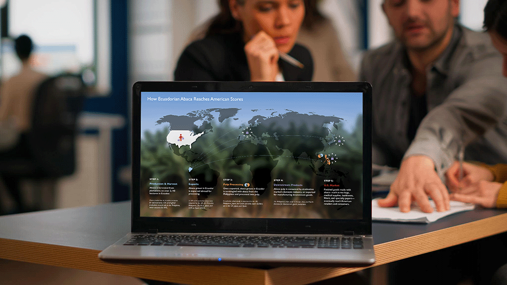
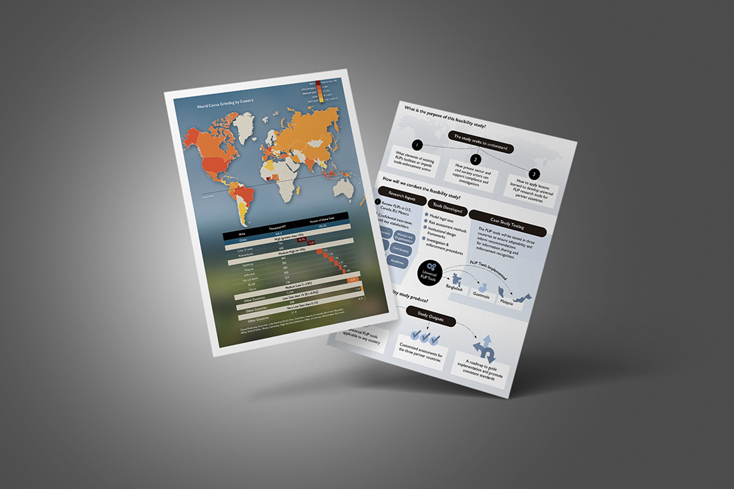
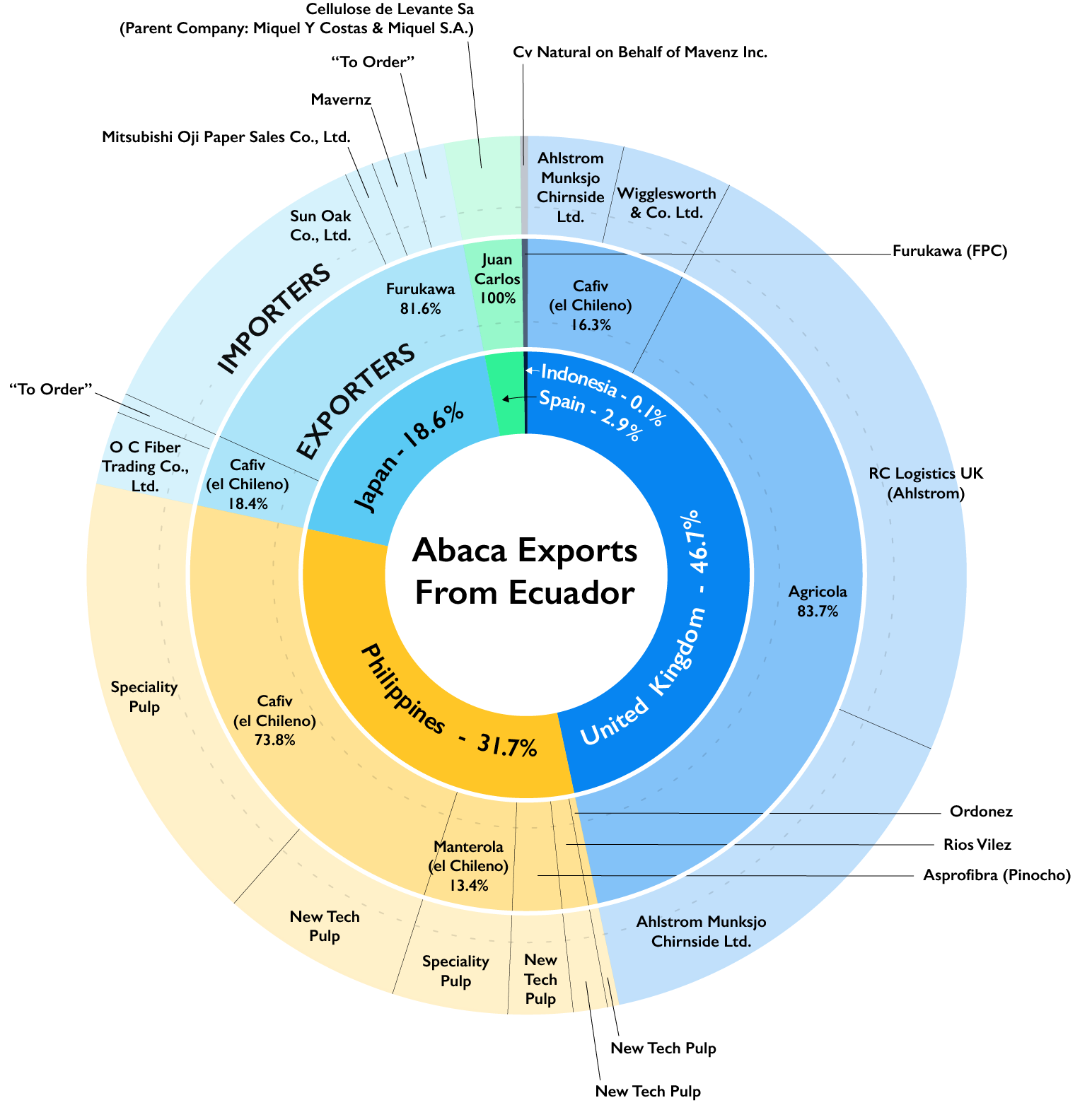
I design visuals that turn numbers and relationships into something people can quickly make sense of. From charts and maps to more complex diagrams, I organize information so patterns, relationships, and key takeaways are easy to see—and easy to remember.
WHAT I DESIGN
From individual graphics to full visual systems, my work includes:
Charts and graphs
Process diagrams and workflows
Maps and geographic visualizations
Infographics and visual summaries
Frameworks and system diagrams
Data-driven visuals for reports and presentations
MY APPROACH
I work closely with content to:
Identify the key message or takeaway
Simplify and organize complex information
Establish clear hierarchy and flow
Ensure accuracy and accessibility
Integrate visuals seamlessly into reports, presentations, and other materials
WHERE THIS WORK LIVES
Data visualization is often part of a larger system. My work is commonly developed for:
Research and technical reports
Government publications
Proposals and presentations
Advocacy and communications materials